Why I stopped using Openclaw: what my personal dashboard revealed
Why I stopped using Openclaw: what my personal dashboard revealed
A personal dashboard becomes genuinely useful when it tells you something you did not want to admit.
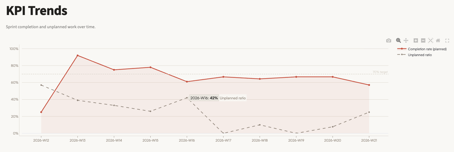
I have been building my own dashboard for personal and company management: not a decorative collection of metrics, but a way to see what I plan, what I complete, and what keeps hijacking the week. One of its charts compares my planned sprint completion rate with the ratio of work that was not planned at the beginning of the week.
The chart surfaced a remarkably clear change. In 2026-W16, my unplanned work ratio was 42%. In 2026-W17 - the week of 20 to 26 April 2026, when I stopped using my hosted Openclaw setup as my daily tool - it fell to 0%.
One week does not prove causality. But the following weeks were enough to make the pattern worth investigating.
What the dashboard actually showed
Before the change, between weeks 12 and 16, the unplanned ratio averaged roughly 39%. From weeks 17 to 21, it averaged roughly 9%. It did not stay at zero forever, and I would not expect it to: real businesses produce interruptions. Still, the shift is substantial.
There is another detail that matters. Planned completion did not collapse when I changed tools. It remained broadly around the mid-60% range for most of the subsequent weeks. The dashboard therefore did not show me giving up output in exchange for a quieter life. It showed a similar planned-work rhythm with far less reactive work mixed into it.
I was also completing many tasks while using Openclaw. The problem is that activity alone can be a misleading productivity metric. If a meaningful share of the tasks exists because the system meant to help you requires maintaining, debugging, deploying, or monitoring, a long completed-task list is not necessarily a win.
That is precisely why I track unplanned work. It distinguishes progress on the work I chose from time spent servicing complexity I accidentally adopted.
A good technical setup can still be the wrong setup
My Openclaw deployment was not careless. I had built a reasonably secure setup on AWS, running in its own Docker container and designed so that I could eventually onboard other users if the need arose.
As a technical project, that made sense. As a tool for my own daily work, it was increasingly asking the wrong thing of me.
A hosted system brings a surface area with it: infrastructure decisions, deployments, configuration, troubleshooting, security considerations, and the temptation to keep extending something because it could become a product later. For an application serving clients or a team, those costs may be justified. For a solo workflow whose job is simply to help me execute, they were turning into operational noise.
This is an easy trap for technical founders and ambitious small businesses. We can build the more elaborate system, so we assume it must be the more professional choice. Sometimes it is. Sometimes it quietly converts a simple need into an internal platform that someone now has to operate.
In this case, that someone was me.
The simpler replacement
I switched to a much simpler arrangement: Codex running on my personal computer, with a workflow I can also control from my phone.
It is not as architecturally ambitious as maintaining my own hosted assistant environment. That is the point. I have direct control when I need it, without carrying a separate cloud deployment as part of my normal working week.
For my current needs, the USD 20 subscription tiers I use with OpenAI and Anthropic are more than enough. I am also consuming tokens more deliberately because the workflow gives me more visibility and control than my previous setup did. I spend less time feeding an autonomous system and more time deciding exactly where assistance is useful.
The important lesson is not that local tools are always better than hosted ones, nor that one AI product should replace every other one. The lesson is that the best tool is the one whose operational burden matches the job.
If I needed an always-on service for multiple users, formal access boundaries, shared workflows, or customer-facing availability, a hosted architecture might again be the correct answer. I did not need those things for this use case. I needed focused assistance that did not become another system to maintain.
Why personal dashboards matter
Without the dashboard, I would have described the change mostly as a feeling: fewer headaches, fewer distractions, less infrastructure friction. Feelings are useful signals, but they are easy to dismiss, especially when a technically impressive system is involved.
There is a line commonly attributed to Warren Buffett that captures the point: “If you can’t read the scoreboard, you don’t know the score. If you don’t know the score, you can’t tell the winners from the losers.” I have not found a primary transcript for that attribution, but the operational principle is right: measurement turns a vague impression into a decision you can examine.
The dashboard gave me a better conversation with myself. It made visible that:
- throughput alone was not enough to judge the tool;
- unplanned work was a cost of my technology choice;
- a simpler workflow could preserve execution while reducing interruptions;
- the right time to simplify is before maintenance becomes normal background noise.
This kind of measurement does not need an enterprise analytics programme. A useful personal or company operations dashboard can start with a few disciplined questions:
- What did we plan to do this week?
- What did we actually finish?
- How much unplanned work appeared?
- What caused that unplanned work: clients, sales, defects, infrastructure, or tool maintenance?
- Did a change in process or technology reduce that burden over several weeks?
One additional practice makes the chart far more valuable: annotate operational changes. A new tool, a deployment, a process redesign, a new client workflow. Otherwise, even a visible improvement becomes hard to explain later.
The AI adoption question most businesses skip
When businesses consider AI, the conversation often starts with capability: what can this tool do? Can it automate a task? Can it run agents? Can it connect to our systems?
Those questions matter. They are not enough.
The missing question is: what new work will this tool create for us?
That includes setup, governance, monitoring, training, exception handling, access control, security, maintenance, and the human attention needed to keep the workflow trustworthy. A tool can be impressive in a demo and still be a poor operational fit. It can automate visible tasks while producing invisible ones.
This is particularly relevant for SMEs. Smaller teams rarely have excess capacity for internal infrastructure experiments that slowly become permanent obligations. The useful AI choice is not always the one with the broadest promise. It is the one that improves the actual week: fewer repeated tasks, fewer preventable interruptions, clearer control, and measurable time returned to the business.
My dashboard did not tell me to stop experimenting with AI. It told me to become more selective about the complexity I accept in exchange for it.
That is a result I can use in my own work, and a principle I now bring even more strongly to AI coaching: do not choose technology by excitement alone. Define the job, measure the operational cost, and keep the simplest setup that produces a real advantage.
If you are exploring AI tools for your business and want to separate useful leverage from expensive distraction, that is exactly the kind of decision I help teams make through my AI coaching and advisory services.